


How to analyze public healthcare datasets (even if you're non-technical)
Get Out-Of-Pocket in your email
Looking to hire the best talent in healthcare? Check out the OOP Talent Collective - where vetted candidates are looking for their next gig. Learn more here or check it out yourself.
 Hire from the Out-Of-Pocket talent collective
Healthcare 101 Crash Course
%20(1).gif)
Featured Jobs
Finance Associate - Spark Advisors
- Spark Advisors helps seniors enroll in Medicare and understand their benefits by monitoring coverage, figuring out the right benefits, and deal with insurance issues. They're hiring a finance associate.
- firsthand is building technology and services to dramatically change the lives of those with serious mental illness who have fallen through the gaps in the safety net. They are hiring a data engineer to build first of its kind infrastructure to empower their peer-led care team.
- J2 Health brings together best in class data and purpose built software to enable healthcare organizations to optimize provider network performance. They're hiring a data scientist.
Looking for a job in health tech? Check out the other awesome healthcare jobs on the job board + give your preferences to get alerted to new postings.
This is a joint post by Bea Capistrant and Nikhil Krishnan. The informative stuff is Bea, the esoteric jokes are Nikhil; but the enthusiasm? That’s you 😏.
Does this sound like you?
- You need a benchmark to evaluate your program or need to know how many people in a state had a certain condition for opportunity sizing. For cocktail conversation reasons.
- You’re wondering whether your company's performance is above/below the national average. And maybe you have LinkedIn jobs open in another tab.
- You want an easy way to find how big the market for a point solution is in a given geographic market because some VC told you the TAM is too small and you need to prove them wrong out of personal vengeance.
- You’ve become weird and isolated and into niche hobbies.
Then you’ve come to the right place. If you know where to look, you can answer these questions with online tools and healthcare data repositories that are publicly available. Some online analysis tools are quite easy to use and helpful; others are rather lacking; and some federal survey data still do not have any analysis tool other than downloading data files and using statistical software to extract findings.
This post is for operators/product people trying to figure out practical and business impact and not necessarily capital-"S" scientific impact - academics close your eyes. Ideally, you can do it yourself without a data team or trying to remember whatever software you used in your intro stats class like SPSS or a TI-83 (shudder).
We’ll start with a framework to identify relevant data sources and a catalog of some of those datasets' features --- and explain how they might be useful to someone wanting to get a quick answer with a relatively low lift. Finally, we’ll go through some examples of market sizing including a practical use of chatGPT to slice up data.
We’ll also pretentiously but correctly be referring to data as a plural going forward.
Where’s that good good (healthcare data)?
Most data that are relevant for healthcare startups come from organizations within the US Department of Health and Human Services (HHS). There are some ancillary data from other agencies that could be helpful for more general demographic and economic questions, but for most part, our HHS agencies are likely going to be the best bet.The FBI probably has the best health dataset (wave to your agent!), but we’re not going to touch that topic today.
Across those agencies, there are a few popular data sources that can be organized by general topic or type of data. You can ask your data team about where to start. As you know, data teams love being pinged with random one-off questions from people across the organization about analyses they need to do.
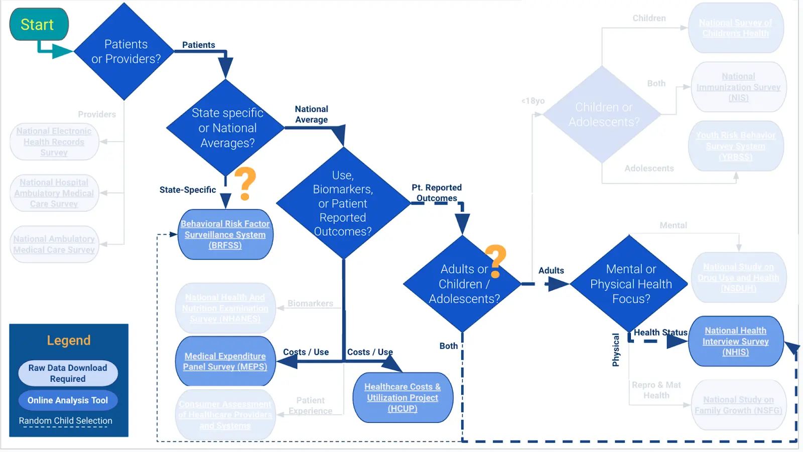
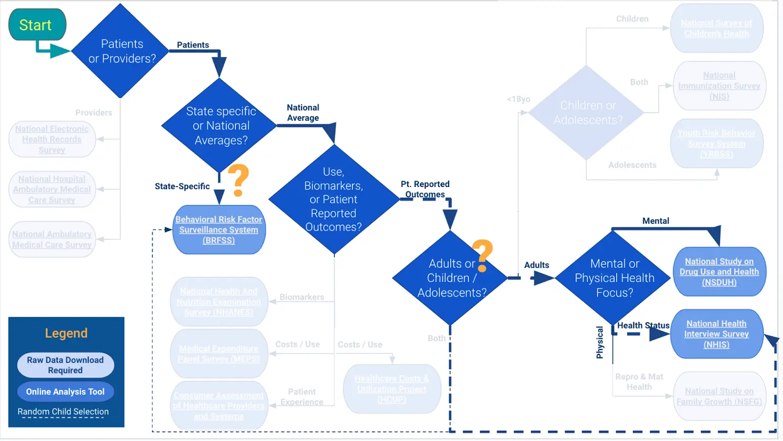
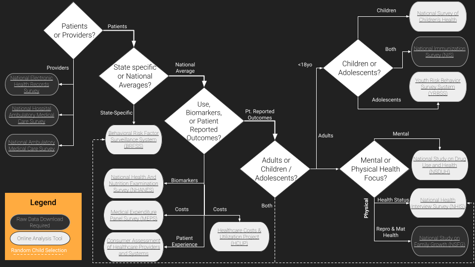
But just in case they’re busy, we made this workflow diagram / framework to help you figure out where your best starting point should be, depending on what you want to analyze.
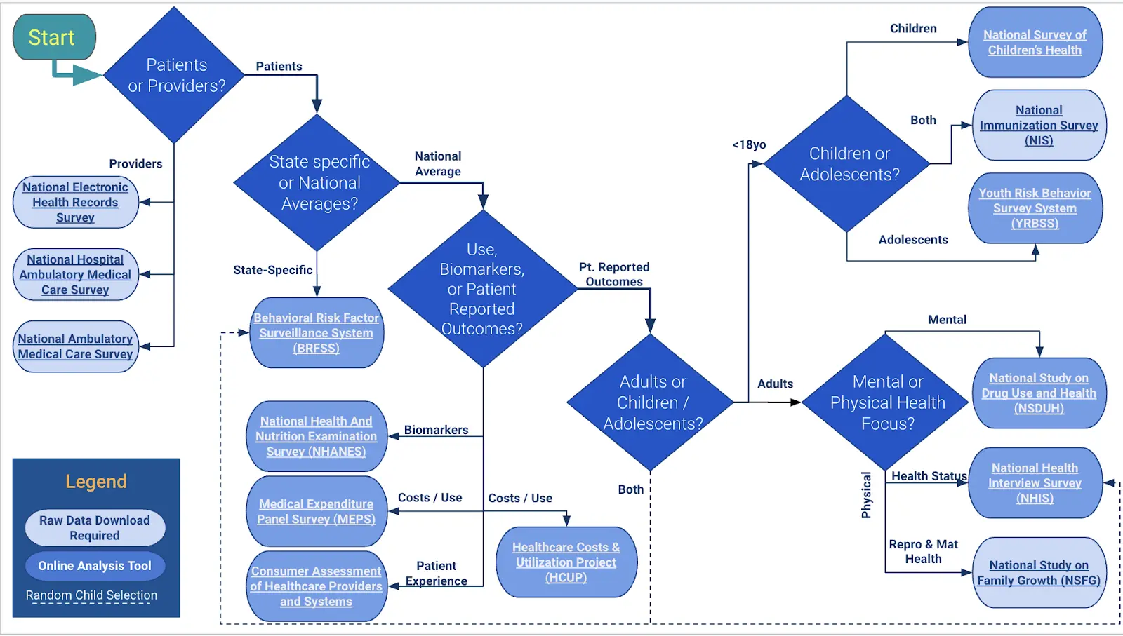
Essentially the question points are:
- Who do you want data on: patients/people or providers/institutions?
- What level of geographic specificity do you need: state-level or national?
- What population: adults or children?
----Of children, teens or younger? - What topic or type of data do you need: direct physiological markers, care utilization and costs, or patient reported outcomes?
---Of patient reported outcomes, what focus area: patient experience, mental health & substance use, or physical health?
---Of physical health, what focus area: general health status or fertility & reproductive health? - What’s your fant-ta-ta-syyyyyyy?
What are the data? And can you analyze it online?
The decision tree focuses on the general topic of the data, but there are many dimensions and features of the data that may well be important to consider about each source. What's the sample size? How often are data collected? Is the study design longitudinal with multiple surveys of the same person over time or a cross-sectional snapshot of a different sample of people every time?
We made a catalog / table with all of this information in the diagram below for each study. If you know what data you need, or want to choose based on one of the factors below (e.g., sample size), this would be a good place to start.
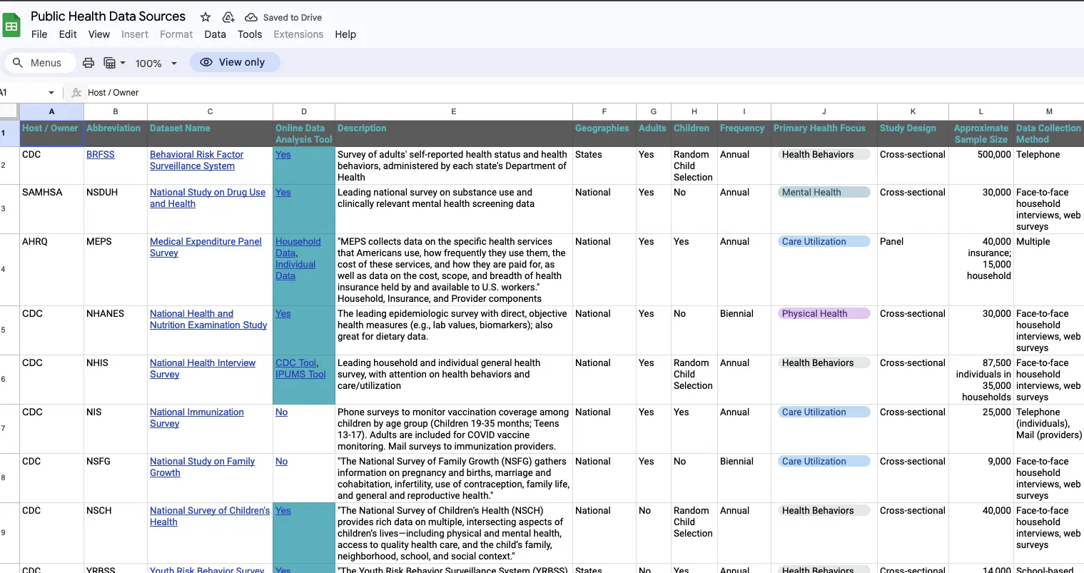
Now what do you do with that data? If you’re in product, ops, or strategy - you’re probably scared of “developer environments”. Maybe you’ve gone to some of these websites and suddenly it downloads a JSON file that you have no idea what to do with or the excel file is 40K+ rows and your computer laughs, sputters, and dies. Have no fear because many of these sites have their own online analysis tool that lets you visualize this data and get an answer relatively quickly so you can slice the data within your browser.

The surveys with visualization tools and query functions are:
- Behavioral Risk Factor Surveillance System (BRFSS)
- National Health and Nutrition Examination Survey (NHANES)
- Medical Expenditure Panel Survey (MEPS): Household or Individual Data
- Consumer Assessment of Healthcare Providers and Systems (CAHPS)
- Healthcare Costs & Utilization Project (HCUP)
- National Study on Drug Use and Health (NSDUH)
- National Health Interview Survey (NHIS)
- National Survey of Childrens' Health
- Youth Risk Behavior Survey System (YRBSS)
What can you get from these online analysis tools?
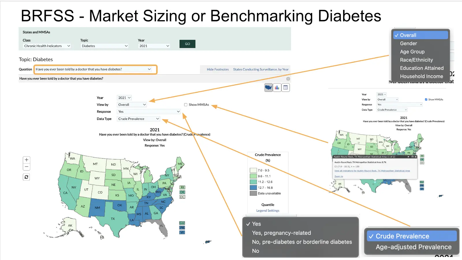
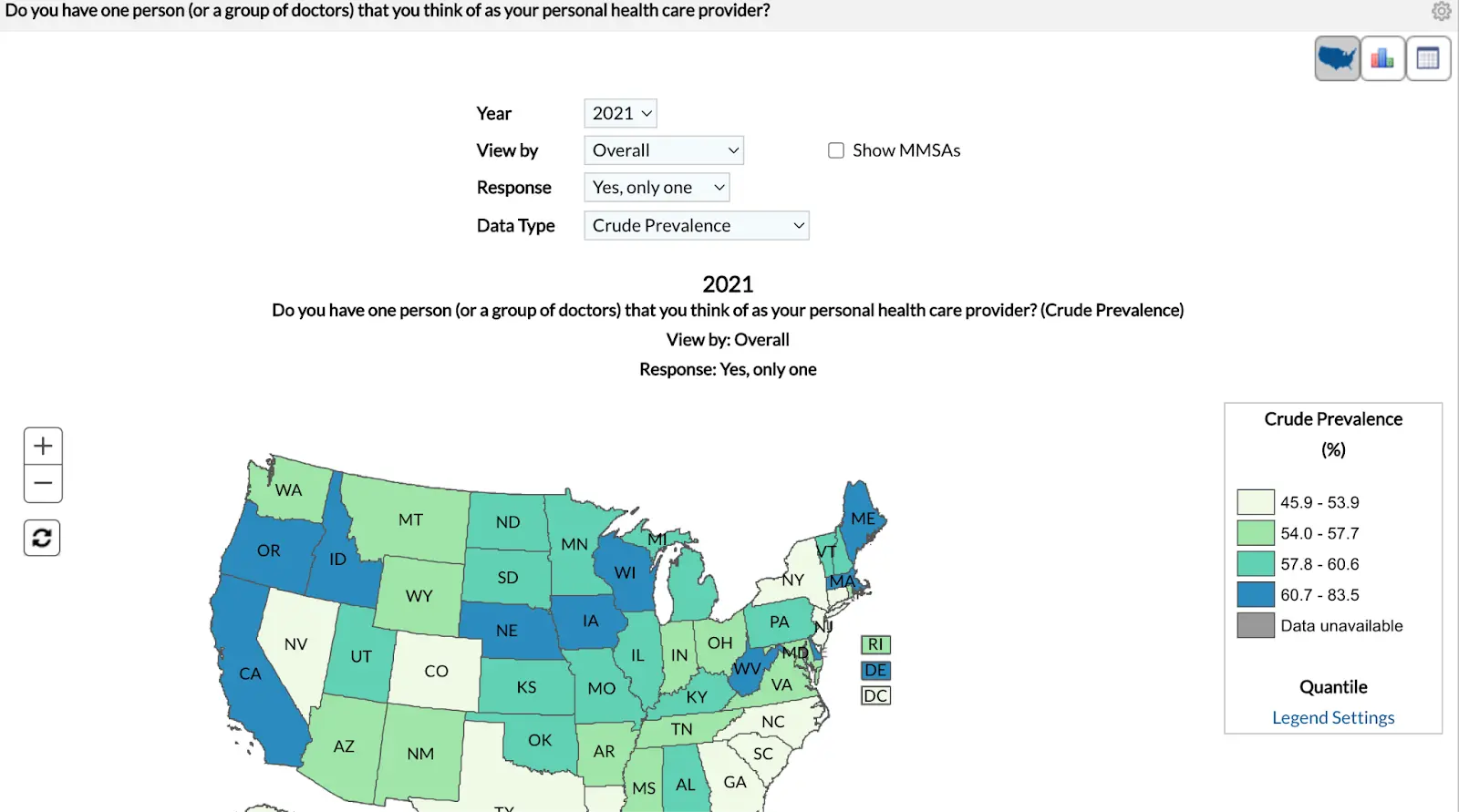
As a glimpse of what some of these tools look like, BRFSS is a good example for looking at patient-reported data - especially health status and behaviors. It has the largest sample size and the best capacity for a state or metro-area analysis of the other studies. The Prevalence and Trends Data Tool allows users to select one of the survey questions and see each state's average responses displayed in a map, graph, or table. There are some additional features for more detailed analyses:
- Age Adjustment: some states' residents are older/younger than others. This tool will account for age in the prevalence estimate, which makes more even comparisons between states. If you squint at the data, you’ll see that states with more 30 year olds have increased behavioral risk for “existential dread”, which is great if your job is to enroll people into MBAs.
- Break down averages by sociodemographic factors: you can go one level deeper and get estimates by one of a few demographic factors like age, gender, race/ethnicity, or socioeconomic factors like education and household income.
- Look at specific answers: Some questions have multiple answers that get at different nuances of the question. For example, asking whether or not you have diabetes can get even nuanced answers like “yes”, “gestational”, or “prediabetes”. Even if the questions are just yes/no, you may be more interested in one of those options over the other.
- Metro Area analyses: You can explore the data another level below states via Major Metropolitan Statistical Areas (MMSAs), which are an administrative grouping of population-dense urban and suburban areas. You know someone is a little too into their job if they use the word MSA to talk about geography.
Some limitations and strengths
- If you’re looking to get a quick and dirty number of people with condition X in one of the market areas or how common Y is to compare against, these tools likely get the job done. Most other common business questions would need the raw data and better analysis tools.
- Not all online analysis tools are very intuitive to use. For example, this more sophisticated analysis tool with BRFSS data gives substantially more features and flexibility --- if you know what you're trying to make. The interface is just kind of unintuitive for non-data people, but don’t worry, someone is definitely raising for their AI startup right now that’s just a better search interface for this.
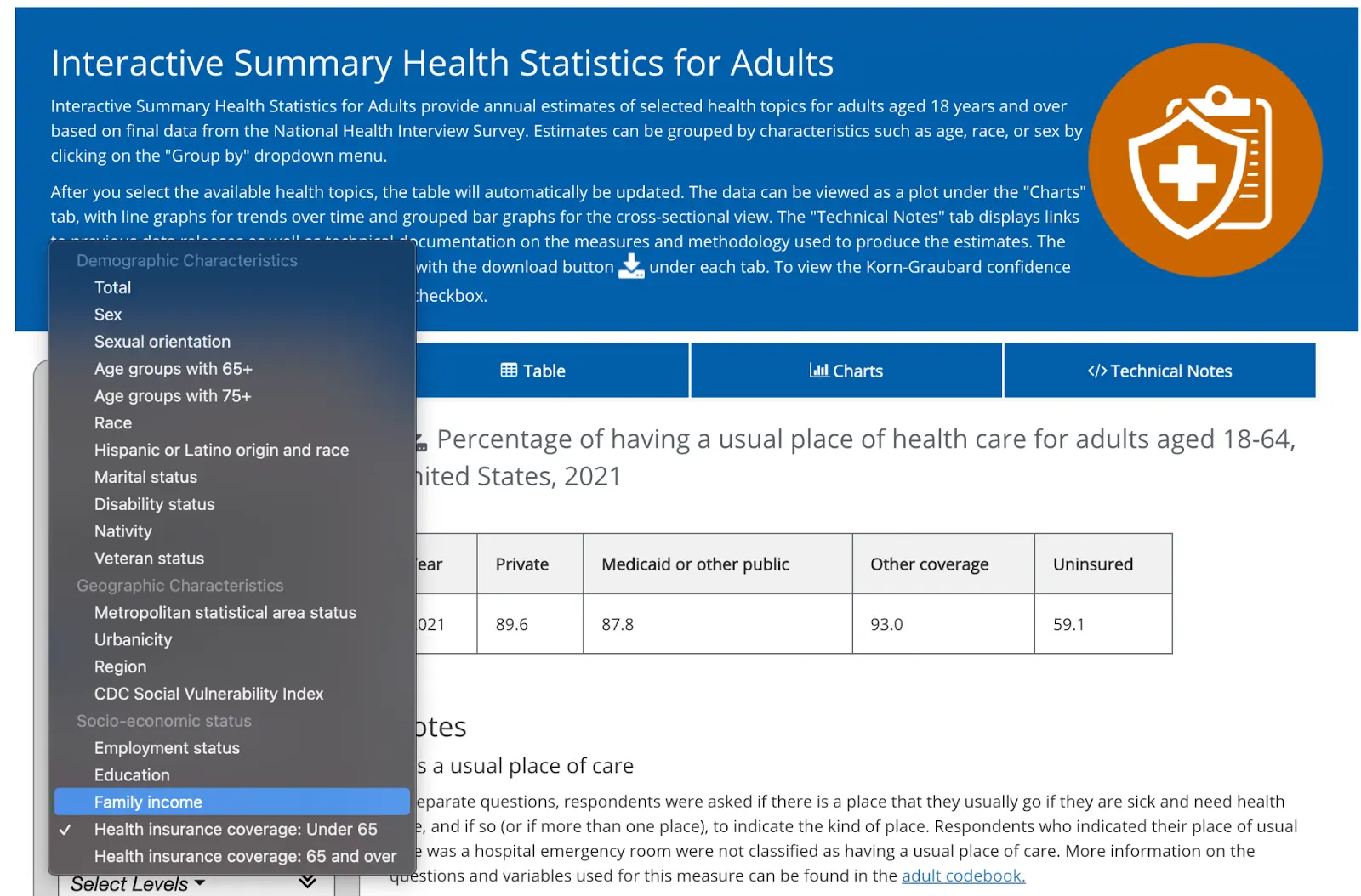
- There isn't a consistent tool used across surveys, even for those administered by the same agencies. AHRQ uses tools that look effectively like white-labeled Tableau dashboards, with a good balance of features (visual and analytic) while maintaining a simple user interface. Other CDC surveys look quite different from each other – NHIS has a similar set of features than BRFSS – but not enough so that knowing one tool makes it easier to analyze another CDC survey. You remember all of those acronyms, right?
Let’s run through a couple of examples to see how far we can get with these public datasets.
Example 1: Benchmarking primary care
Let’s imagine you want to get an estimate of adults’ use of primary care. That’s broad, but a flexible definition may be good at this point. If you work through the decision tree, there’s a few different data sources that come up:
- If you want state-specific data, BRFSS might be worth a shot.
- Since you very likely want data on health care cost and utilization,, MEPS is an obvious choice.
---HCUP is for inpatient hospital data only, so it doesn't really apply here. - And since adults’ primary care use might be self-reported, NHIS could also be possible.
Here’s what we find both in terms of the measure they’re looking at and what the result is.
The Measure(s) of Primary Care question in BRFSS is actually pretty spot on, while MEPS and NHIS ask more vaguely about a “usual source of care”. For example, I have a usual source of care. It’s my first year med school friend that’s overconfident in their abilities, but that’s not exactly primary care.
But each dataset gives a similar-ish answer, so we know we’re in the right ballpark. From here, you can use each survey to break down the answers in different dimensions.
For example, NHIS lets you disaggregate that by many individual characteristics. You can see socioeconomic, demographic, geographic (they have a term called “urbanicity” which feels made up?). Here’s a not shocking stat: less than 60% of people that are uninsured have a usual place of care vs. 85%+ for anyone with insurance coverage.
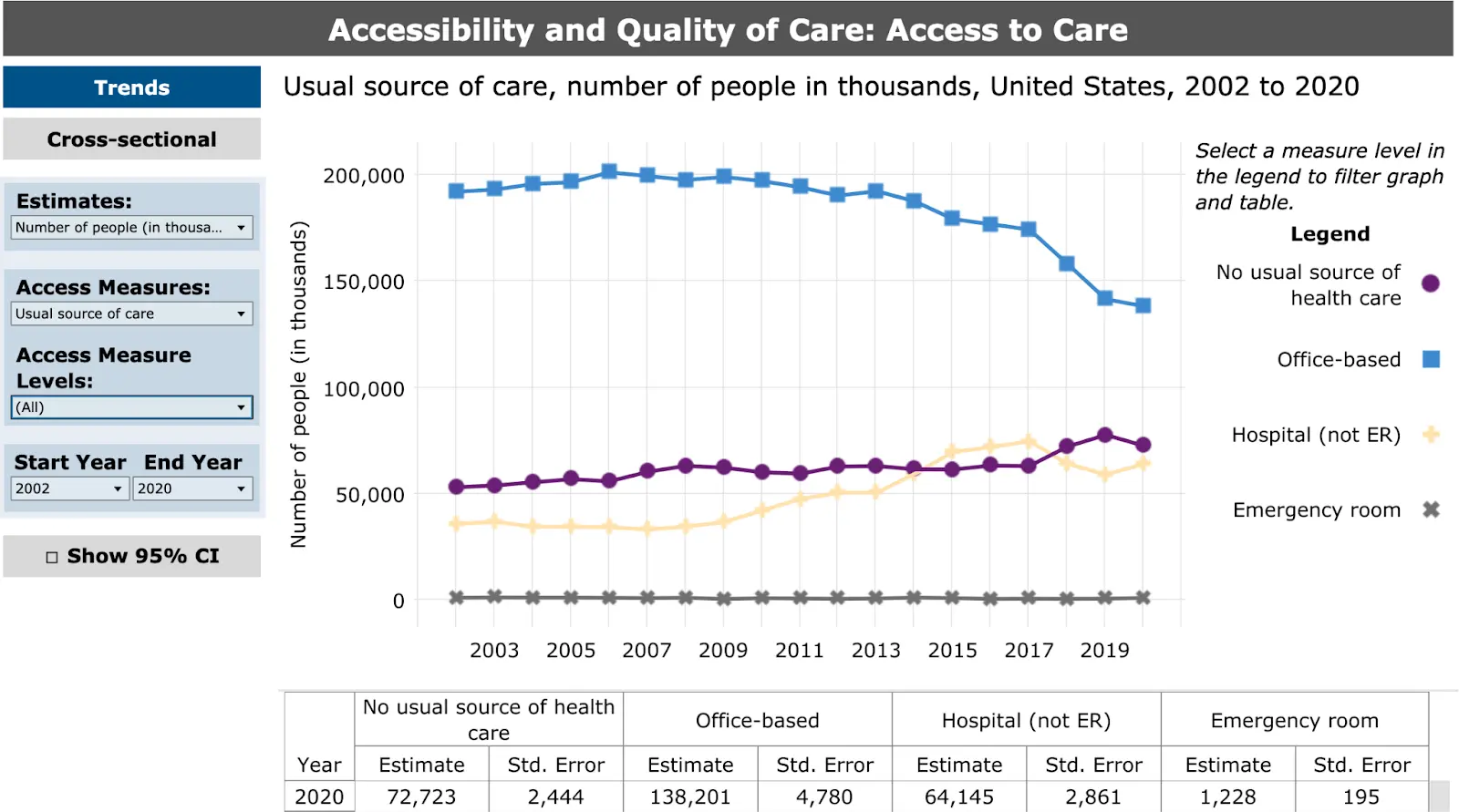
MEPS breaks out the answer not just as yes/no, but per location. It also has a much longer time window – back 20 years compared to the other survey’s 1-3 year period. You can actually see the collapse of the individual family medicine doctor! Cool! Wait not cool.
BRFSS of course has state and metropolitan area level estimates. It can disaggregate by some, but far fewer characteristics than NHIS. You can see how wide the variance is based on state - any statistic about the “US” is sort of meaningless when you have this much geographic variance.
It’s worth noting that these questions leave a lot to be desired: they don’t include information about how often the respondent saw their PCP, you don’t know the type of provider (MD, DO, PA, NP), and a lot of other natural follow-up questions. MEPS has lots of other great questions about access to and quality of care, but it’s impossible to know whether those refer to the individual’s PCP or not. You’d need the raw data to look at the relationship between those variables.
That said, these online tools can at least give you a benchmark. If you had done research to assess primary care usage of your customers and the median percentage with a PCP was 40% – would you know if that’s low or high? Now you know, and that’s half the battle.
Example 2: Market sizing for a substance use treatment product
For market sizing, you’re probably more interested in the number of people rather than a relative percentage. You want to know how many people you could sell to or include in a contract. One benefit of many of these surveys is that they calculate weighted averages that should be nationally representative (more or less, but don’t take our word for it – read the fine print).
Those estimates tend not to be in these online analysis tools, but you could do some simple math to multiply the % with the condition by the US adult population and get a rough estimate of how many people there are. But if you were good at math then you would’ve actually gotten that engineering degree, huh?
Let’s say we’re focusing on a substance use disorder company making a pitch to a payer in a new state. You want to find city or state specific data AND we know substance use is largely patient reported and focused on mental/behavioral health. Following our diagram - the best bets are BRFSS, NHIS, and NSDUH.
BRFSS has alcohol use but not drug use, and NHIS has nothing. But NSDUH is the jackpot. They have clinical measures of SUD based on the gold-standard diagnostic criteria including a calculation of respondents who had SUD and needed treatment. They even have state level estimates in the map below.
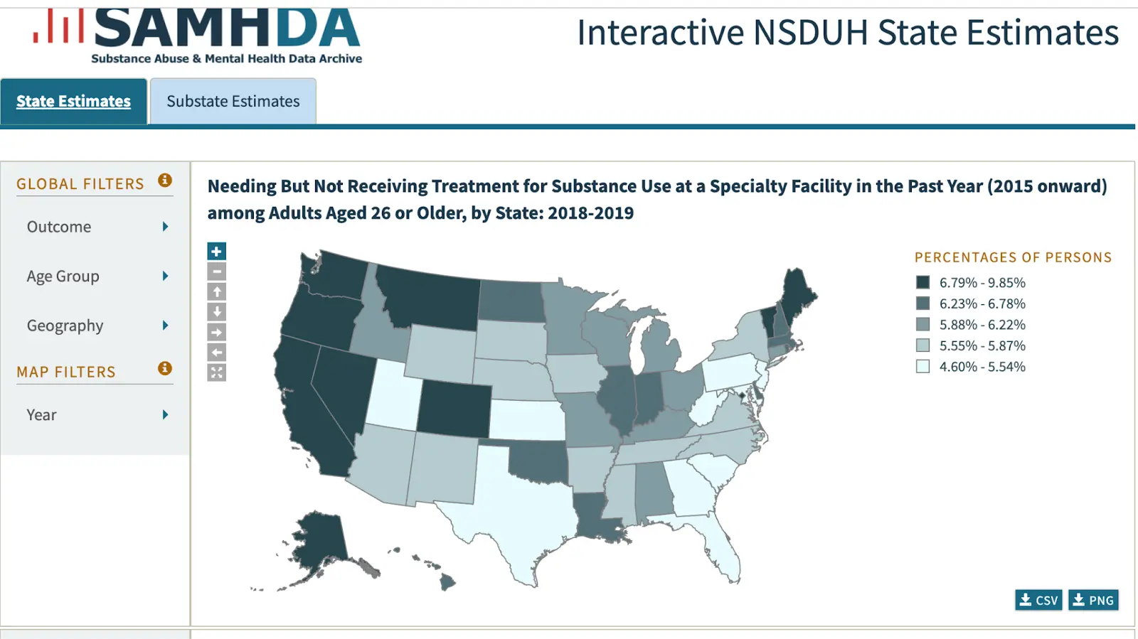
Their other analysis tools give more numeric data, including a cross-tab feature where you can get a two-dimensional estimate: not just who has SUD and needs treatment, but by many other variables: specific drugs, mental health status, demographics, and so on. For market sizing a SUD treatment product, you might want how many people who had SUD and needed treatment also had private insurance - maybe even broken down further into specific age groups.
Sure there are more statistical features than you may need (e.g. chi-square tests) and you have to be clear on how you want the data arranged. Plus the font game and capitalization is absolutely all over the place like a backend engineer just winged the interface.
BUT…you could land on something that’s pretty close to exactly what you’d need to know the market size: of the 11.5 million total people aged 35-49 who needed treatment for SUD, 6 million had private insurance.
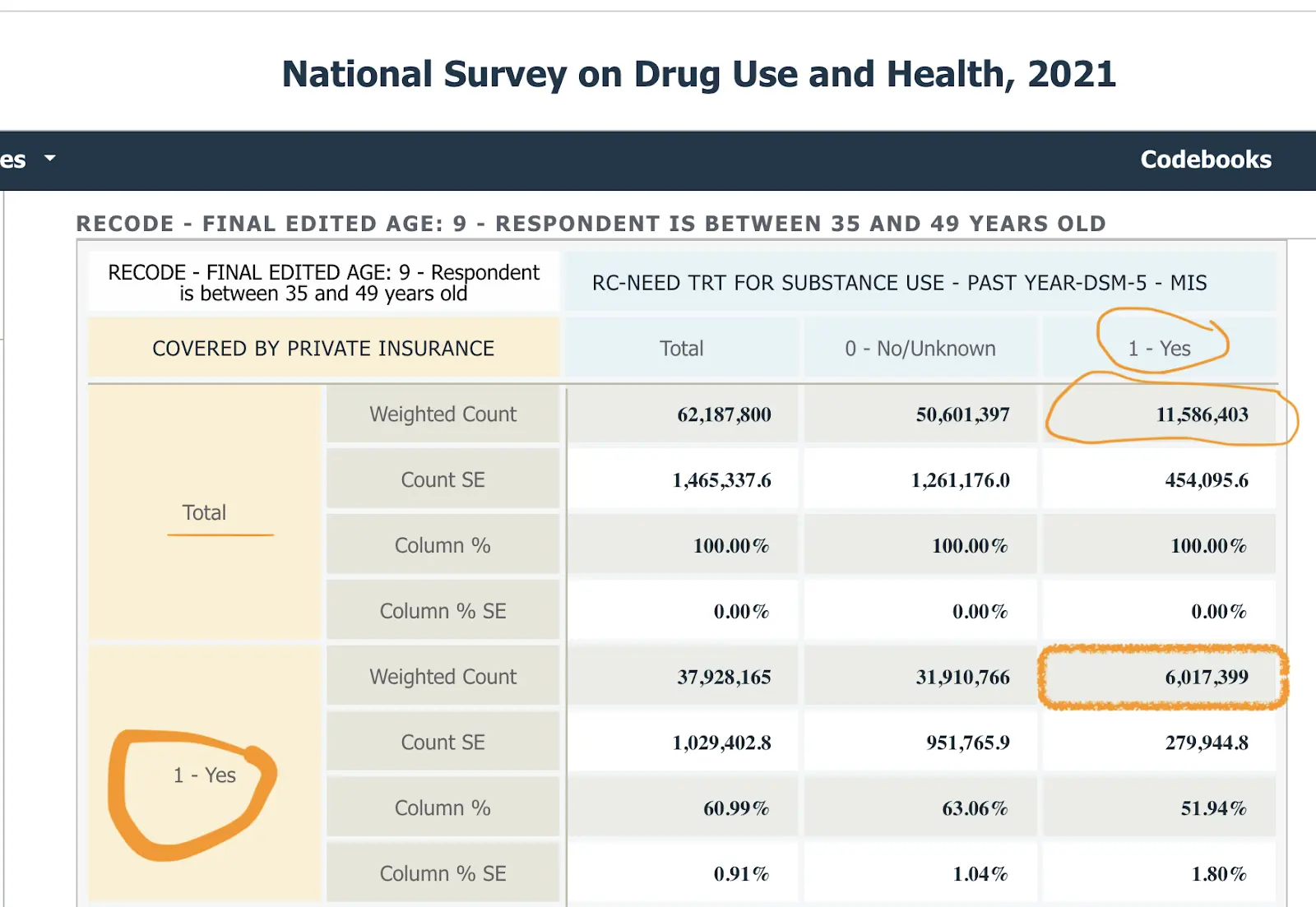
That’s a pretty good estimate for the size of the market – closer to the answer you’d want for market size than in the primary care examples above for benchmarking. This level of specificity comes largely from NSDUH having an extremely good measure – not too high-level, actionable just enough on some goldilocks shit, etc. If you’re early in building your business case or pitch, this level of precision probably works just fine.
You can see that this tool gives you very different options for data (much more of it) and has a very different and more complex user interface. This serves as an intermediate sort of solution between very simple online analysis tools and dealing with the raw data.
Example 3: Ethnicity, Medicaid, and ED use - the power of ChatGPT
So far we’ve looked at analyses where you can pretty effectively slice and visualize it within the browser itself. However, you’re frequently going to run into one of the following issues:
- The visualization tools don’t do the slicing and dicing you want.
- You’re trying to chain together several variables and maybe even manipulate the variables to make it cleaner.
- You’re trying to combine a few datasets together to get a clearer picture.
- The aesthetics of a .gov site are making you question which year you’re in.
Let’s go back to the first example where you want to know where someone gets their usual care, but now you want to slice it by both Medicaid status AND race. This is a good example to illustrate my point because there are three different variables you want to test - the place they get care, their race, and their Medicaid status. You can get close with the MEPS online tool, but you can’t get Medicaid status.
You could go to the data team at this point, but you've been gloating about how you don’t need them. Hmmm can we actually use ChatGPT to do this analysis with its new Code Interpreter plug-in? This plug-in basically creates code for you based on your prompts and will analyze a given dataset, though you need to have a paid account.
Here’s a link where you can see Nikhil’s conversation with ChatGPT to do this analysis on MEPS data as an example. You need to know a little bit about the data and the variables, but it can pretty effectively guide you on which variables to use and generate visualizations for you. We downloaded this data and made an excel table of these variables to map to. You can see the rest in the chat transcript; it kinda blew my mind.
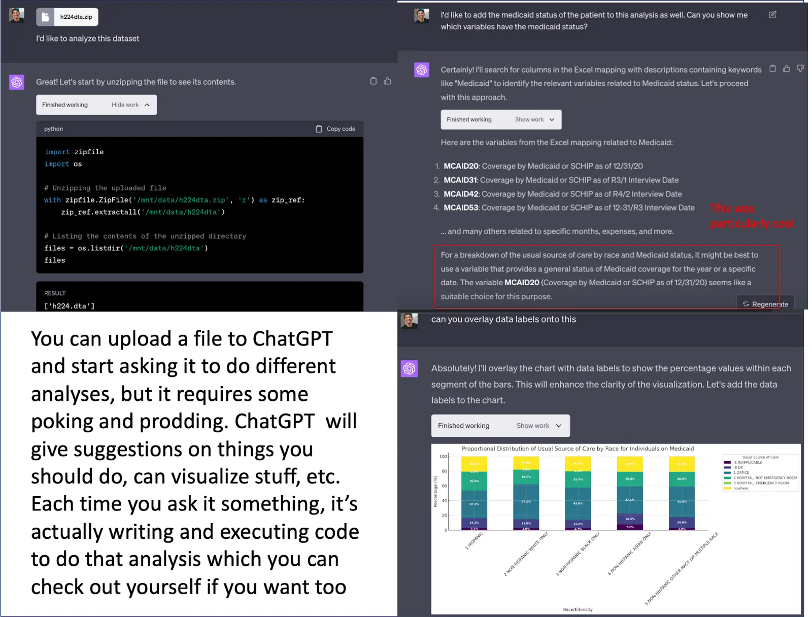
This is really hacky but can work if you need a few quick answers. It does become cumbersome to manipulate, especially if you’re planning to come back to this analysis or dataset in the future because ChatGPT doesn’t store the dataset.
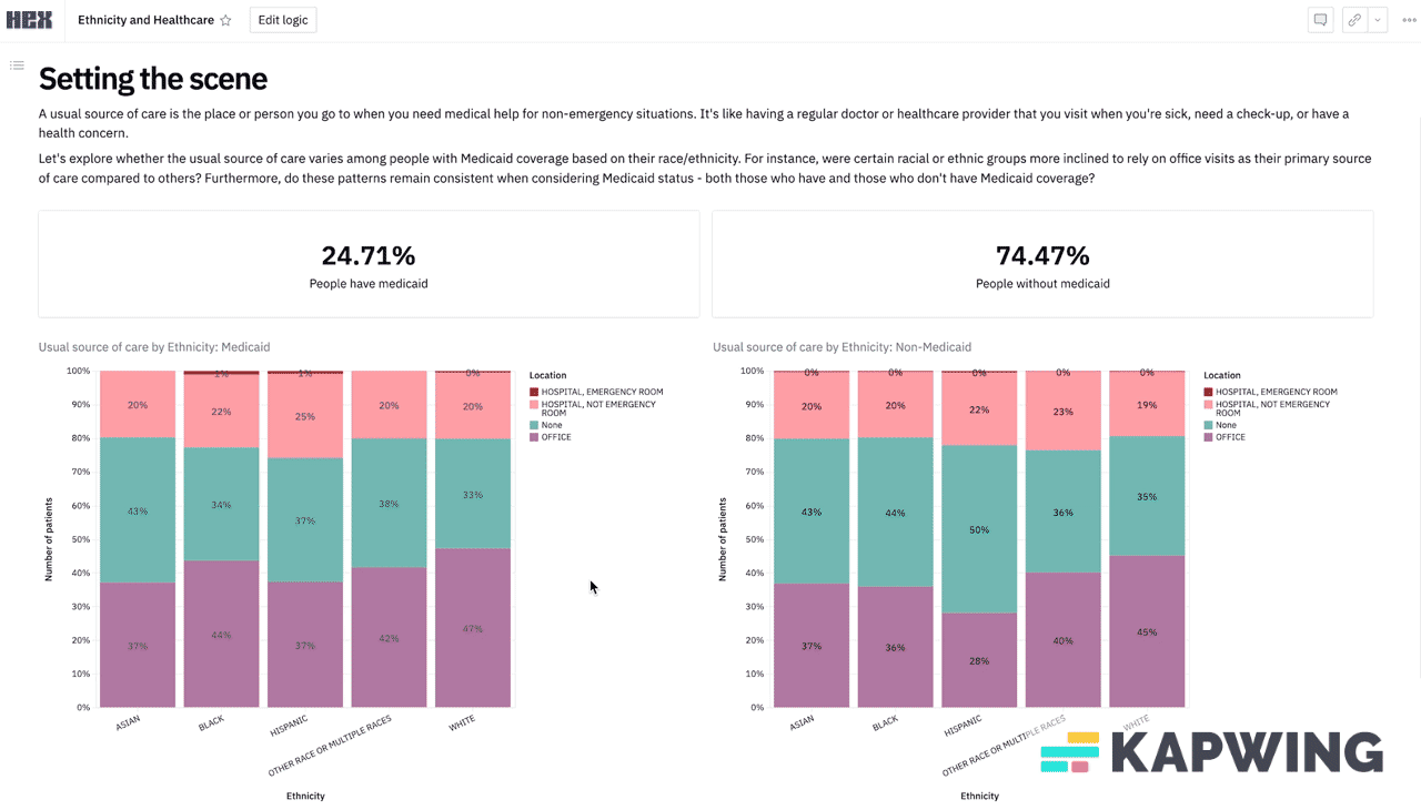
If this is an analysis you think is going to require multiple cuts in the future, teammates to collaborate on, etc. you probably want a data analyst to at least get you set up on something with dashboards. We loaded this same dataset into a Hex* notebook which is more like a low-code platform that lets your data team write a script once and then you can start manipulating and slicing the variables yourself. You can play around with it here and see what I mean. (*Disclosure: Nikhil’s portfolio company).
Search engines to find other data
Instead of starting with the data, you might start with the search tools. These can potentially help guide you TO the datasets you might need.
Federal data search engines and data aggregators:
- Healthcare.gov: data from the national insurance marketplace, with information on medical and dental plans, community providers, links to machine readable public use files on network, and formulary information
- Healthdata.gov: searchable site of 4k+ government data sources (not just surveys)
- CDC Wonder: a good starting point for demographic events (birth and death), HIV/STD epidemiological data, some population projection data
Public data sources that likely include data on specific topics (which may be less generalizable, and more likely require working with the raw data):
- Kaggle: a popular site for data science competitions (and data hosted for those competitions)
- Google Dataset Search: Google, but for publicly available datasets
Academic hosts, non-profits, and other aggregators of data:
- IPUMS: demographic, economic, and health data --- over time. They have harmonized NHIS and MEPS, among others, to simplify working with raw survey data as questions and answers change over time. There are some analysis tools as well, but it’s primarily for accessing the raw data.
- ICPSR: a University of Michigan research center that hosts lots of NIH- funded study data. NIH changed the rules a few years ago and now is requiring grantees to have a plan to make their NIH-funded work more publicly available.
Wrapping it up - become one with the data
There are lots of data, generally from federally funded surveys, that can serve common business needs in healthcare and health tech. Two use cases in particular can be answered relatively quickly: benchmarking your prevalence against an average, and identifying the market size for a new product.
The table/catalog of surveys and their contents hopefully help find a useful solution more quickly. Message me (or leave a comment in the catalog) if you have other data sources you think should be included.
Most surveys have online analysis tools that will do the job for basic uses, and it's worth getting to know one or two of these tools to get these estimates fast and easily. They aren't perfect, but they're definitely better than nothing. At the very least the data team will stop shit talking you at the happy hours.
Thinksquad out,
Nikhil aka “the one asking for data pulls” and Bea aka “the one annoyed about it”
Twitter: @nikillinit
Other posts: outofpocket.health/posts
P.S. Wanna get freaky with more advanced data? You should take the Claims Data 101 course since that's the basis of more data analyses in healthcare.
{{sub-form}}
---
If you’re enjoying the newsletter, do me a solid and shoot this over to a friend or healthcare slack channel and tell them to sign up. The line between unemployment and founder of a startup is traction and whether your parents believe you have a job.
Interlude - Courses!!!
See All Courses →We have many courses currently enrolling. As always, hit us up for group deals or custom stuff or just to talk cause we’re all lonely on this big blue planet.

